
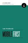

Part 1: Why Mobile First?
- Growth
- Constraints
- Capabilities
Part 2: How to go Mobile
- Organization
- Actions
- Inputs
- Layout
· · · · · · (收起)
- Growth
- Constraints
- Capabilities
Part 2: How to go Mobile
- Organization
- Actions
- Inputs
- Layout
· · · · · · (收起)
具體描述
Our industry’s long wait for the complete, strategic guide to mobile web design is finally over. Former Yahoo! design architect and co-creator of Bagcheck Luke Wroblewski knows more about mobile experience than the rest of us, and packs all he knows into this entertaining, to-the-point guidebook. Its data-driven strategies and battle tested techniques will make you a master of mobile—and improve your non-mobile design, too!
用戶評價
評分
##移動網頁設計
評分
這年頭的書, 數據更新不及時的話就沒法看啊, 哪怕寫得再好.
評分
這年頭的書, 數據更新不及時的話就沒法看啊, 哪怕寫得再好.
評分
##例子太老...對比去過的例子倒是看齣瞭進步
評分
##這是一本關於手機App上交互設計的書,不是關於移動互聯網趨勢的書。
評分
##Just an introductory booklet, don't expect too too much ^^
評分
##Just an introductory booklet, don't expect too too much ^^
評分
##移動網頁設計













##1. Contect over navigation 2. Sticking to the bottom 3. Maintain clearity and focus